Saksham' Blog

I wonder if I put a few words here?

Page 3 of 3

Module 3: Storytelling and Creating Videos

Module Summary


In this week’s module, we discovered the importance of story telling and how it can have major impacts in all areas of life, especially teaching. We went over the rich tradition of story telling which helps transmit information over to the next generations. Followed by the relevance of video creation and how story telling becomes much easier via video format. There are also some things we need to keep in mind while creating content in form of videos to convey an insightful and convincing story which includes:

  • Focusing on Learning Outcomes
  • Keeping the content short
  • Adding visual elements
  • Using a conventional tone

These were some points which we learnt from Mayer’s various principles which help us carve out a better story overall!

Importance of Scriptwriting


As a student without any theatre background, writing down a story in form of a script before executing it was not a very obvious concept. After watching the attached videos in Module 3 and researching more about it, I realized how important it can be to pre-process the creation of a video to save time and resources later on if we realize that the final product is not satisfactory.

While working on the story for Twine in this module which is attached below, I practiced this by creating a rough script in a clear, informal language with a structure as suggested in the Module. Storyboards also end up being helpful when working on stories as it helps us visualize the concept we want in our end product. I would definitely try to integrate a storyboard as a part of pre-planning phase for the Assignment 2 Video!

Twine Story


I tried spending some days to learn more about Twine as a platform. “Non-linear branched narratives” means that we do not have linear story path, instead we can have multiple options as a part of different pages which makes the story interactive and also dynamic since the story takes a different turn on every decision made by the user. We can visualize it as a tree which branches out into multiple other branches, in a similar manner a branched narrative story unfolds into multiple options.

This is the link to the hosted story: https://saksham1009.github.io/EDCI337/


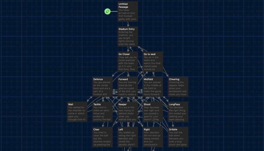
The story I chose to display was of a kid visiting a football match in a stadium for the first time which was the final match for FIFA World Cup. The story unfolded itself where in the kid gets a chance to get onto the field to play at different positions and also got to experience the match through his seat. Now, I would not want to spoil all the plot but after my Assignment 1’s feedback I made sure to include the things that I learnt from the Module and my own research into the implementation which majorly impacted the quality of text written in the story. I kept in mind the concepts mentioned above which would make the story realistic and relatable!

Reflection Question – What storytelling techniques have you used instinctively and which ones require more work for you? Which techniques will you focus on moving forward?


I tried implementing all the techniques mentioned above in some capacity including keeping it short, focusing on learning outcomes, using a conventional tone, including active learning, keeping text and images together and building in accessibility.

Even though these factors mentioned above were part of my execution, the factor that I intentionally worked on to use and will take forward with me is creating a story with an emotional pull as mentioned in the “Storytelling” section in Module 3. Describing sentences that visualizes the scenario and takes the reader into the story seemed really relevant and interesting to me. I have consciously tried to make sentences include describing words to make the story immersive. For example, a line from the story in Twine which I wrote was “You smell the aroma of grass spread across the stadium” which according to me makes the experience of reading a story almost virtually real.

Do Remember to checkout the story from the link given above:)

Module 2 Blog

Overview

In this blog, we would be going over the learnings from this weeks Module 2, WAVE accessibility report and a piece of infographic content.
We’ll take a look at how inclusive design and infographics can help boosting learning efficiency and also makes it accessible for everyone.

WAVE Accessibility report

The image above describes different metrics like Errors, Contrast Errors, Alerts, Features, Structural Elements and ARIA about the last blogpost Module 1.

After reviewing the WAVE report, there are multiple areas where I think I could improve to create a better blog overall. After digging deeper into the concepts from Module 2, I feel like I am more informed about creating and structuring the topics so that it is easier to understand and more engaging as well.

Journey Map illustration using infographics

This is a Journey Map created using Canvas which was created for a Software Engineering course to evaluate what a user for a specific problem which in this case is Communication goes through on a daily basis. This describes the different actions and scenarios that a user has to take and experience in an organized manner.

Looking backwards, integration of infographics is an essential part of the education. The project would not have been complete or would be really difficult to understand these metrics if a chart or visual representation like above was not included.

Reflecting back on Module 2 – Reflection Question

Q: Graphic design is inherently visual – what additions or modifications could you make to ensure that learners with visual impairments have access to the same information in an infographic in an online setting?

Including graphically represented information has become a key part of educational content as discussed above. While being visual is a key feature of graphical designs there are many more aspects which could be added or modified to enhance the experience even more.

  • Alt Text: Including description for all the images in case the image is not visible on the webpage. Also, for accessibility purposed it is always beneficial to have an alternate text which describes the image show up under the image. (I have added it under the infographic illustration added above)
  • Color: To make the illustration stand out and catch the reader’s attention, we should have contrasting colours which could also act as functional part of the image. An example for that would be having different colours show different percentages while making calorific charts.
  • Interactive Elements: Engaging users can be really helpful especially when the content is dense or new to the readers. Having parts of the graphical design which can be moved around or interacted with by the user can end up making the content more fun and easier to be hooked onto.

By implementing these additions and modifications, we can ensure that learners with impairments and those who require accessibility inputs have equal access to the information presented in an infographic, promoting inclusivity and accessibility in online learning environments.

My experience with Multimedia Learning

Discovering more about Loom

In this Module, I created a screencasting on QuickTime of a quick walk around Loom. In the walkthrough, I went over how and why to use Loom. What are the features that it offers and how it can help make life easier for people on different types of operating systems to view the original file without changing extensions.

Mayer’s Principles

There were certain aspects of Mayer’s principles that I tried to maximize the Intrinsic Cognitive Load by segregating the topic description into high level features and then summing them up later to explain the logic better. I try to break down the reasons behind the popularity and utility to give better context as well.

Overall, if someone goes over this tutorial video, they would be able to navigate and make proper use of functionalities that Loom offers as a service and communicate better via videos.

Loom Walkthrough

Reflecting

I think Active Processing was something that really caught my attention as I have seen some examples where that was a problem in my own experiences. Active Processing becomes a huge part especially when the amount of information being consumed increases. To tackle this, I believe having video content and other presentations really help as we did above!

Introduction Blog

Hello Hello,

My name is Saksham Dua and I am international student taking Computer Science at University of Victoria. I’m originally from India but I have been in Victoria for more than 2 years now. I’m in the third year of my computer science degree and have about 3 terms left before graduation.

I love to play football(soccer), go on long drives and play cricket in my spare time. I also love watching movies and shows, recently I have been hooked on to Suits (I know I am a bit late to the wave). Also love to cook Indian food and try different restaurants around Victoria.

Excited for this term!

Welcome and Introduction

Before proceeding with this first blog post, we expect you to consider your privacy preferences carefully and that you have considered the following options:

  1. Do you want to be online vs. offline?
  2. Do you want to use your name (or part thereof) vs. a pseudonym (e.g., West Coast Teacher)?
  3. Do you want to have your blog public vs. private? (Note, you can set individual blog posts private or password protected or have an entire blog set to private)
  4. Have you considered whether you are posting within or outside of Canada? This blog on opened.ca is hosted within Canada. That said, any public blog posts can have its content aggregated/curated onto social networks outside of Canada.

First tasks you might explore with your new blog:

  • Go into its admin panel found by adding /wp-admin at the end of your blog’s URL
  • Add new category or tags to organize your blog posts – found under “Posts” (but do not remove the pre-existing categories or sub-categories).  If you would like to add more course categories, please do so (e.g., add EDCI 306A with no space for Music Ed, etc.)
  • See if your blog posts are appearing on the course website (you must have the course categories assigned to a post first and have provided your instructor with your blog URL)
  • Add pages
  • Embed images or set featured images and embed video in blog posts and pages (can be your own media or that found on the internet, but consider free or creative commons licensed works)
  • Under Appearance,
    • Select your preferred website theme and customize to your preferences (New title, etc.)
    • Customize menus & navigation
    • Use widgets to customize blog content and features
  • Delete this starter post (or switch it to draft status if you want to keep for reference)

Do consider creating categories for each course that you take should you wish to document your learning (or from professional learning activities outside of formal courses). Keep note, however, that you may wish to use the course topic as the category as opposed to the course number as those outside of your program would not be familiar with the number (e.g., we use “Multimedia Learning” instead of “edci337).

Lastly, as always, be aware of the FIPPA as it relates to privacy and share only those names/images that you have consent to use or are otherwise public figures. When in doubt, ask us.

Newer posts »

© 2025 Saksham' Blog

Theme by Anders NorenUp ↑