Overview
In this blog, we would be going over the learnings from this weeks Module 2, WAVE accessibility report and a piece of infographic content.
We’ll take a look at how inclusive design and infographics can help boosting learning efficiency and also makes it accessible for everyone.
WAVE Accessibility report
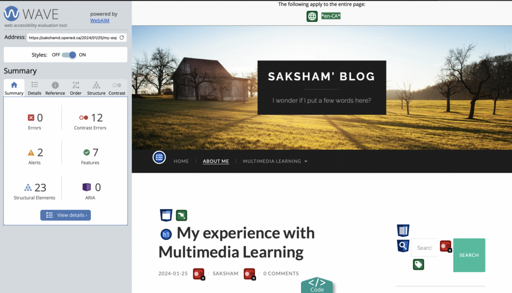
The image above describes different metrics like Errors, Contrast Errors, Alerts, Features, Structural Elements and ARIA about the last blogpost Module 1.
After reviewing the WAVE report, there are multiple areas where I think I could improve to create a better blog overall. After digging deeper into the concepts from Module 2, I feel like I am more informed about creating and structuring the topics so that it is easier to understand and more engaging as well.
Journey Map illustration using infographics
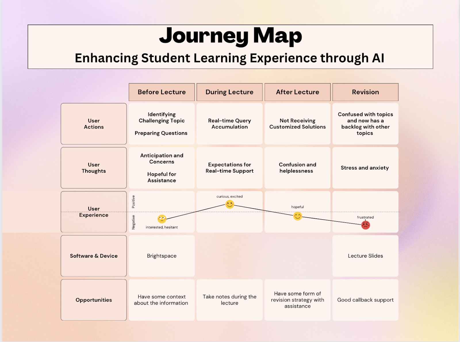
This is a Journey Map created using Canvas which was created for a Software Engineering course to evaluate what a user for a specific problem which in this case is Communication goes through on a daily basis. This describes the different actions and scenarios that a user has to take and experience in an organized manner.
Looking backwards, integration of infographics is an essential part of the education. The project would not have been complete or would be really difficult to understand these metrics if a chart or visual representation like above was not included.
Reflecting back on Module 2 – Reflection Question
Q: Graphic design is inherently visual – what additions or modifications could you make to ensure that learners with visual impairments have access to the same information in an infographic in an online setting?
Including graphically represented information has become a key part of educational content as discussed above. While being visual is a key feature of graphical designs there are many more aspects which could be added or modified to enhance the experience even more.
- Alt Text: Including description for all the images in case the image is not visible on the webpage. Also, for accessibility purposed it is always beneficial to have an alternate text which describes the image show up under the image. (I have added it under the infographic illustration added above)
- Color: To make the illustration stand out and catch the reader’s attention, we should have contrasting colours which could also act as functional part of the image. An example for that would be having different colours show different percentages while making calorific charts.
- Interactive Elements: Engaging users can be really helpful especially when the content is dense or new to the readers. Having parts of the graphical design which can be moved around or interacted with by the user can end up making the content more fun and easier to be hooked onto.
By implementing these additions and modifications, we can ensure that learners with impairments and those who require accessibility inputs have equal access to the information presented in an infographic, promoting inclusivity and accessibility in online learning environments.
Hello Saksham! I really liked the colour palette you chose for the infographic. It is very colourful and pretty without being obnoxious to the eyes. I also liked the way you organized the post as it made it very easy for me to follow along with it. I wanted to ask, because you said that infographics were useful in the education sense, do you believe they are useful in other fields as well? Great post!
Great work on this module Saksham! The infographics pops out and seems very easy to go over and get the information. The blog itself seems very informative and I am confident that it would be a good place to learn about WAVE Accessibility Rating for any reader. The language and design used are very considerate as well. Thanks for sharing the content. Keep up the work!